F1 cars comparison
Eurosport/Yahoo
Graphic and development Chiqui Esteban, Rafael Soares
PublishedMarch 15th 2012
Software HTML, Javascript, Photoshop
Original article:
F1: 2012 in detail
The information
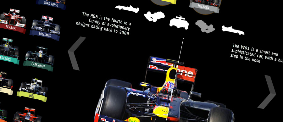
Comparison of the F1 2012 season cars, team by team, drag and drop the two cars you want to compare, move the slider to compare them and use the arrows or icons to make the car spin.
The design
The left area displays all the cars of the season, to be dropped in the circles. We use a slider to do the comparison and a double system (arrows or icons) for the spin. The graphic was published in 9 languages for 12 different countries, so we wanted to be sure that it was easily understandable with the minimum texts and for different visual cultures. Works perfectly on tablets and mobile phones, with a great 'touching' experience.


